Tips To Design Checkout Screens For Mobile Devices
Over the last few years, every individual relies on his smartphone. Even to check the next route right beside him smartphones are used. Well, when a person can rely so much on a smartphone, what makes him do so? Yes, what makes him so comfortable in using mobile devices and so dependent, is that he never thinks of any other alternative.
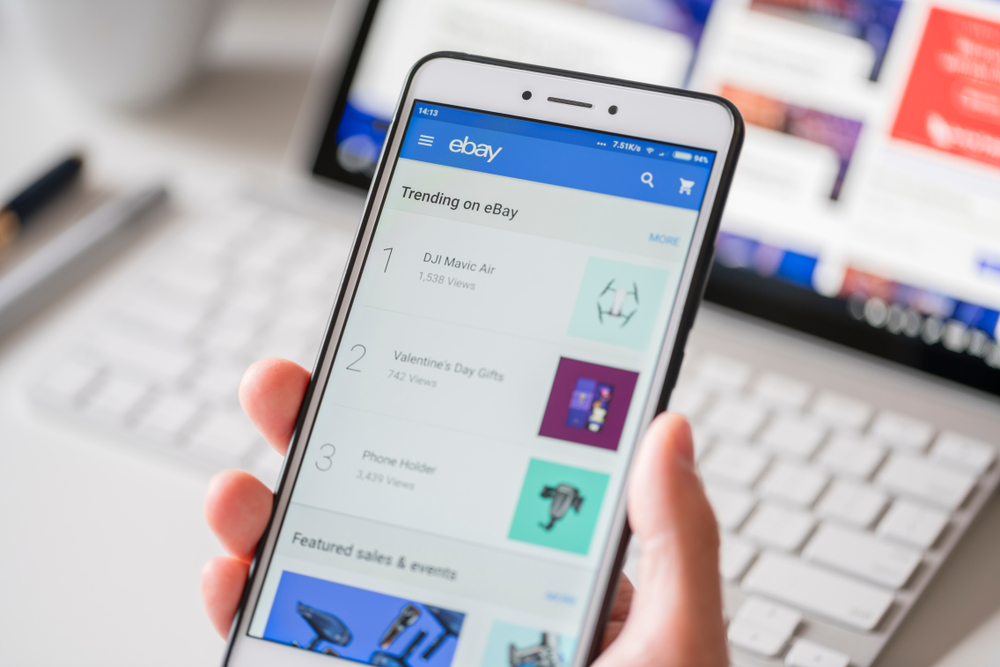
Yes, you are all right, in recent years, mobiles have taken over the use of technology by other means. Because these phones bring the use of possible technology to us. Many shoppers are turning their devices into the potential search for purchasing, as a part of the growth of the business. Many users prefer mobile websites to apps for shopping.
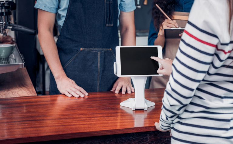
Although many shopping websites don’t provide the check-out option for guests, it is the standard practice across media and very precisely practiced on mobile. Checkout processes help the buyer express his thoughts and provide confirmation before approving any kind of order on the app. Interaction allows using of the apps, functions, and contents of the mobile.
There are certain tips to designing these checkout screens, and it is very important to indulge them in the right way. One could always consider the UX principles of designing from a top UI design company, which may give the expected output.
Ux Principles
this is all about learning about the user and getting knowledge on his experience on how they use the product and their expectations. This is one design that helps the world in the creation of minimalism and gives a clear vision of the world. The use of this design in the development of check out screen has paved the way to put down the frustration and has made it user-friendly.
Editing Options
The editing options need to be incredibly simple, and they should not be tough than required for a user to access. Let’s take an example of an online shopping app, where the editing should be way easier for a customer to review the products. Not just reviewing, but also he or she should be able to change the filters as and when it is required and must have simple options to add the items to the cart and view it without facing any friction. Ideally, a customer must have access to various options with just a few taps.
Before creating these editing options, it is necessary to prioritize the changes that our customers may want to edit before they purchase the product in actuality. So it is very important to keep editing options within their reach before placing the final order. This, in turn, develops trust and healthy relationships, and it also gives assurance to purchase more.
Payment Methods
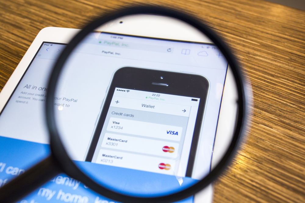
It is very easy to make payments on the desktop or using laptops, but it is not so handy while using a smartphone. Hence, the payment methods should be designed in such a way that the customer doesn’t get any second thoughts while making payments. Yes, money is all about trust and loyalty, and the payment link has to be well designed. It needs to be as simple as possible, and the checkout must have ideally streamlined options in just a few taps.
The Flow Of Checkout
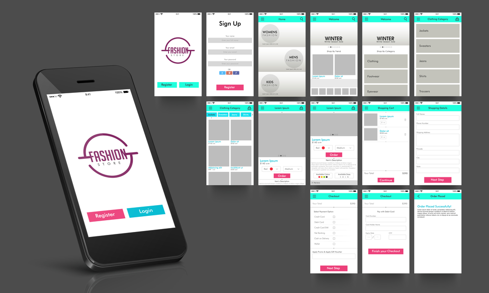
It doesn’t matter what you use, you may use breadcrumbs, tabs, or circular links but it is all linked step-by-step and everything is included in one process. The checkout process helps a customer to go through all steps and tells them exactly how everything is done. Though it looks easy, optimizing each and every function at checkout is a huge process.
Final Overview Of Purchase

Designing the final checkout screen is of utmost importance. At times there is hesitation at the final checkout while placing an order, so to put their minds at ease, it is required to provide the final overview of the purchase.
For example, let’s consider an online shopping app, wherein the final checkout must have a confirmation button, which includes the items purchased, shipping charges, taxes applied on items, and other required details of an order.
Ideally, this can be applied to many non-physical products and the final page can be designed based on the particular requirements. For further information go through https://designmodo.com/mobile-checkout-screens/
Many tests have been conducted in an extensive way to prove that one-page and multi-page both work in different circumstances. Many guest checkouts are created very normally to reduce the friction for the first time to shoppers.
Design For Touch and Not Mouse
According to types of research, the touch has to be designed in a user-friendly interaction way and it is classified into three ways based on the way the smartphone is held,
- One-handed – 49%
- Cradled – 39%
- Two-handed – 15%
Thumb has an important part in design; so, the zones are designed as follows:
- Hard( not often accessible by thumb, needs extra effort to touch)
- Ok ( may be able to touch but not very often)
- Easy( very often used space of screen)
In the long run, it is always preferable to avoid pages and instead favor multiple breaks up pages. Typical typing tends to slow down the mobile. So it is very important to keep the text arena as minimum as possible to create the best view for shoppers at the checkout page.
The final page is the only funnel, which required a keyboard input entry. Hence, the breakdown of the checkout should be in a progress, by placing the minimum number of next steps required in each field. It is the best way to add a progress indicator, which assures and estimates the time it is going to take by checkout. It would be much better if colors were used to identify between active and essential information at the end.